Soft edges
You drop a photo into a layout and need it to meet the surface underneath. Figma has a soft brush. On the web, the first thing everyone tries is a linear gradient to white.
That works in theory. In practice you get a milky stripe across the image. Same height left to right, full width, like someone laid a ruler on the frame and fogged everything below it. The dashed line in the first example sits on that stripe.
The second example stacks soft radials instead (big ones from the bottom corners, a weaker bowl in the middle, a light linear only at the very bottom). The falloff is uneven: more aggressive on the sides, more open in the center. The dashed line follows that shape.
Hard linear
Radial stack
Same photo, same job. One is a band. One is a dissolve. Everything below is how to get the second without inventing a new seam.
Mask vs overlay
A mask thins the image's alpha. Whatever sits behind shows through. No extra paint, no color match to get wrong.
An overlay paints the surface color on top of the pixels. Use it when you need a guaranteed solid under type, and paint that surface exactly: white on a white panel, #FDFDFC on this site's page, not "close enough."
Mask
Overlay
Hard step vs progressive
One jump from opaque to transparent is a cut. Multi-stop masks ease out. More stops in the tail means a slower death, the same idea as easing curves.
Hard step
Progressive
Stop density on the same photo:
Hard
Soft
Long
Radial overlays (morphing card)
When the photo has to die into a known solid so a title can sit half on the image, stack two bottom radials plus a long linear. The radials break the horizontal stripe; the linear seals the edge for type.
Uneven centers and opacities matter. One centered radial looks like a spotlight.
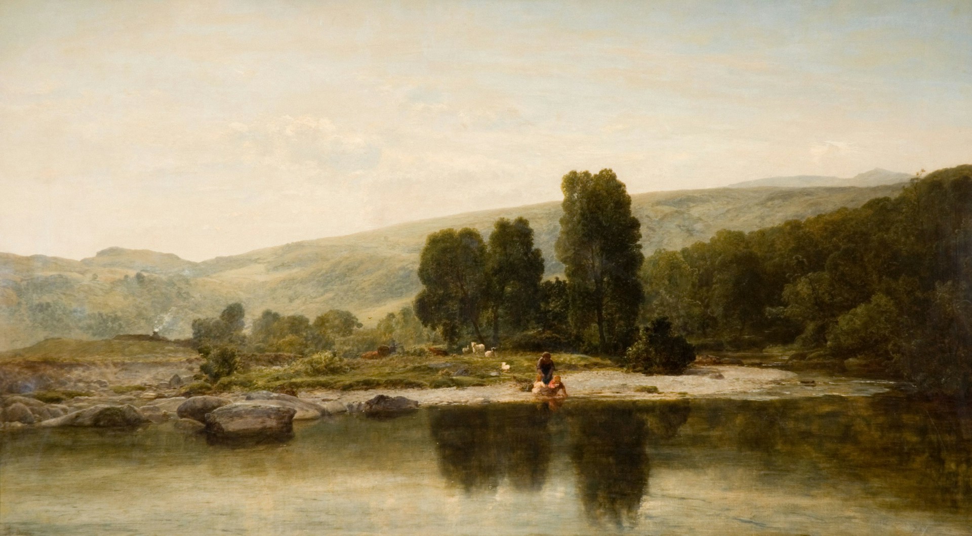
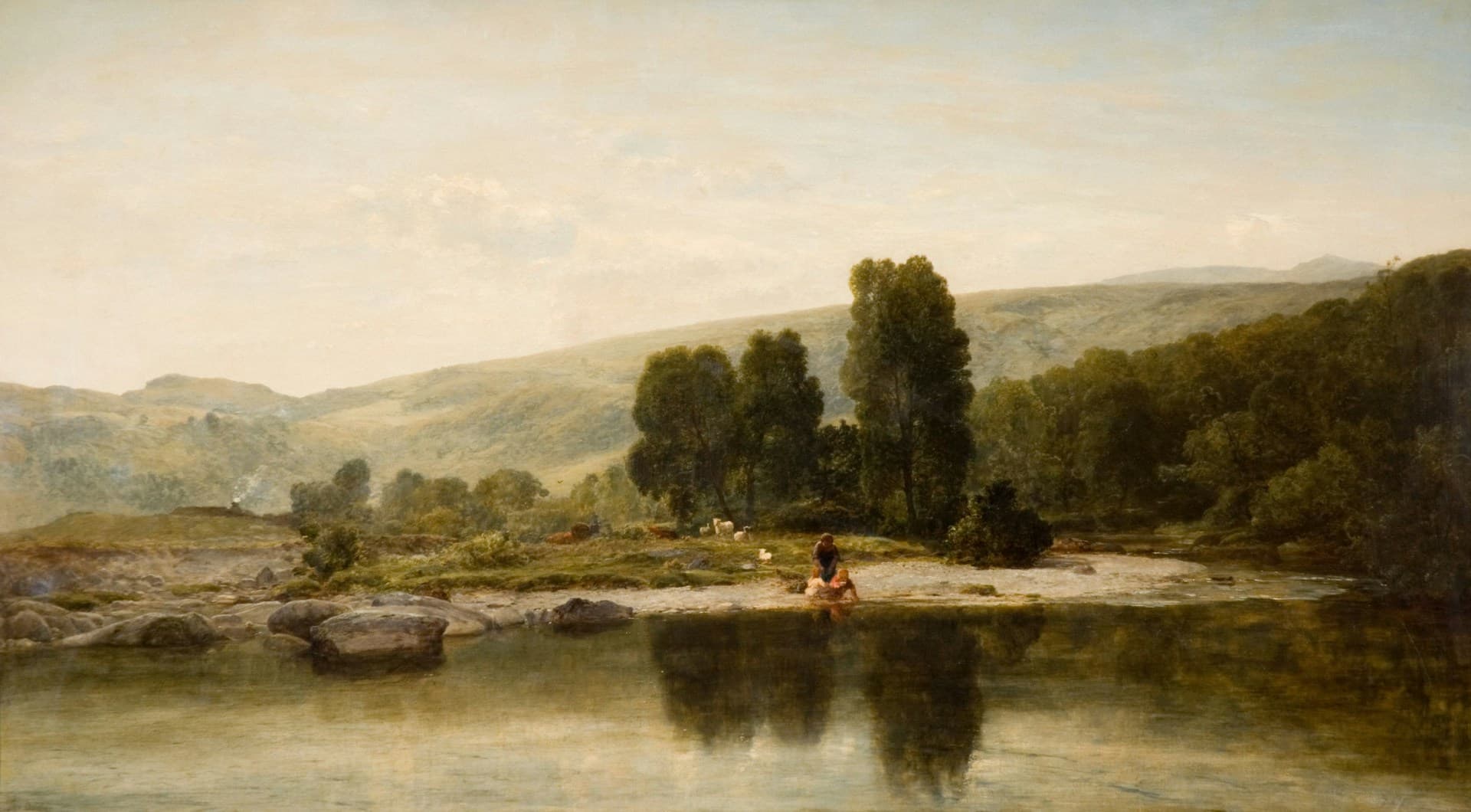
Landscape, 1885
Thomas Danby
Cloud edge
CSS radials still draw geometry. For a round, misty silhouette, build an irregular white shape, run a heavy Gaussian blur on it inside an SVG mask, then apply that mask to the photo. The blur is the whole trick: hard shapes go soft, corners disappear, the edge reads like fog instead of a soft rectangle.
Leave room around the mass so the blur can fall to zero before it hits the frame.
Cloud edge
When to use which
Default to a mask when the photo only needs to disappear into whatever is behind it: the page, a stage, a list peek. You are not inventing a surface color, so mismatches go away.
Use an overlay when something has to sit on the fade: a title pulled up with negative margin, a label that needs a solid. Then the paint color is the panel fill, full stop. Radials under that linear seal are for breaking the stripe, not for decoration.
For floating media that should look soft all the way around, blur a mask shape. A 24px linear strip is not a dissolve. Match the surface when you paint an overlay.